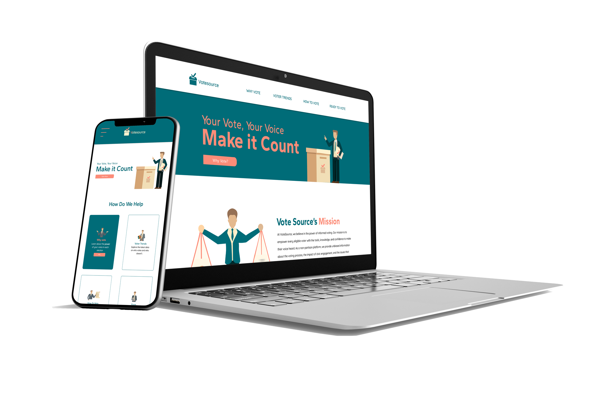
VoteSource is a civic awareness web project designed to empower U.S. voters through accessible, non-partisan information.
The one-page site combines infographics, illustrations, and clear navigation to explain why voting matters, how to vote, and how each vote can impact close elections.
My goal was to transform complex civic data into a visually engaging, mobile-first experience that builds trust, encourages action, and educates users regardless of political background.


Sole designer and front-end developer using SCSS, CSS Grid, Flexbox.

UX research and competitor analysis

Created all illustrations and infographics to create cohesivity

New voters often feel overwhelmed or confused about where and how to start. Clear guidance and accessibility are key to building trust.

With limited time and high mental load, busy parents need fast, reliable answers. Simplicity and clarity make all the difference.

Older voters may hesitate due to uncertainty around time, process, or accessibility. Comfort and reassurance build confidence.
I began the project by grounding myself in the civic tech landscape.
My first task was to analyze competitors and UX patterns across existing voter education platforms. This helped me identify common friction points, cluttered interfaces, partisan tones, and unclear calls to action.
I also reviewed the project brief in detail to clarify goals and scope. To build a solution that truly resonates, I immersed myself in the target market, gathering inspiration from both civic and non-civic digital experiences that prioritize trust, clarity, and guidance.
1
With a clear foundation in place, I moved into wireframing and content design. My goal was to structure the site in a way that guided users through key information without overwhelming them.I created low-fidelity wireframes to define layout, hierarchy, and user flow—prioritizing simplicity, scannability, and mobile responsiveness. These wireframes acted as a blueprint for building trust and ensuring clarity across the experience.
In parallel, I began developing a unique visual language for the project. I designed custom illustrations and infographics to communicate voting concepts in a more engaging and digestible way. From user pain points to civic data, these visuals were critical in transforming complex information into simple, action-driven insights.
Once the structure and visual direction were solidified, I transitioned into high-fidelity UI design and front-end development. My objective was to bring the brand's personality to life while ensuring the interface remained clean, accessible, and action-oriented.
I refined the layout in Figma, applying the established typography system, color palette, and visual components—ensuring consistency across sections. Each design decision was guided by clarity and emotional resonance, with special attention to mobile usability.
On the development side, I built the site using semantic HTML and SCSS, following a mobile-first approach and leveraging CSS Grid and Flexbox to create a responsive, scrollable experience. I also optimized reusability and maintainability by using DRY naming conventions and modular SCSS structure.
2
3
Gantari 46px Semi-Bold
Gantari 38px Bold
Gantari 32px Semi-Bold
Quicksand 18px regular
Lorem ipsum dolor sit amet, consectetur adipiscing elit. Suspendisse varius enim in eros elementum tristique. Duis cursus, mi quis viverra ornare, eros dolor interdum nulla, ut commodo diam libero vitae erat. Aenean faucibus nibh et justo cursus id rutrum lorem imperdiet. Nunc ut sem vitae risus tristique posuere.